05 / Case Study — Fashion · Apparel · Lifestyle
DSRT
A founder-led apparel concept shaped by contrast, movement and the visual language of the desert.
DSRT began as an exploration of how a recognisable South African lifestyle brand could move beyond a logo and become a complete product system.
The concept combines desert-influenced colour, contrasting construction, functional detailing and a restrained visual identity across apparel, accessories, technical specifications and campaign communication.
The project is built around the positioning: Survive the ordinary.
Role
Founder, Brand Designer and Product Concept Designer
Focus
Brand identity, apparel systems and technical development
Output
Garment concepts, technical pack, colourways, labels, accessories and campaigns
Status
Self-initiated concept in development
The idea
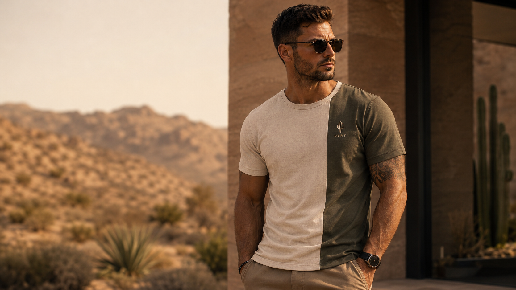
A brand built around contrast.
The central idea behind DSRT is contrast: between the desert and the city, utility and refinement, endurance and everyday comfort.
This contrast became a practical design principle rather than only a visual theme. It informed the split garments, contrasting trims, linings, stitching, labels and restrained use of the burnt-orange accent.
The goal was to create a brand that felt recognisable without relying on oversized logos or predictable outdoorwear styling.
The desert became the design language, not the costume.
Brand foundation
Creating a system that could extend beyond one garment.
The identity was designed to support a broader lifestyle and apparel system.
The cactus-inspired mark, widely spaced wordmark, coordinate details, earth-toned palette and small orange square created a recognisable visual language that could move across clothing, packaging, labels, accessories and communication.
01
Identity
A minimal cactus-inspired symbol, restrained typography and a contrasting orange detail create a mark that remains recognisable at both large and small scale.
02
Colour
Olive, sand, charcoal, stone, navy and rust form a practical palette influenced by desert landscapes and designed to work across multiple product categories.
03
Detail
Coordinates, woven labels, contrast trims and small embroidered elements give the range a consistent signature without making the branding feel excessive.
Apparel system
Designing the garment as part of a wider system.
The apparel range was developed around a core set of versatile pieces that could be worn together and adapted through colour.
Rather than treating each garment as an isolated item, the concept uses recurring construction details, tonal relationships and functional elements to connect the range.
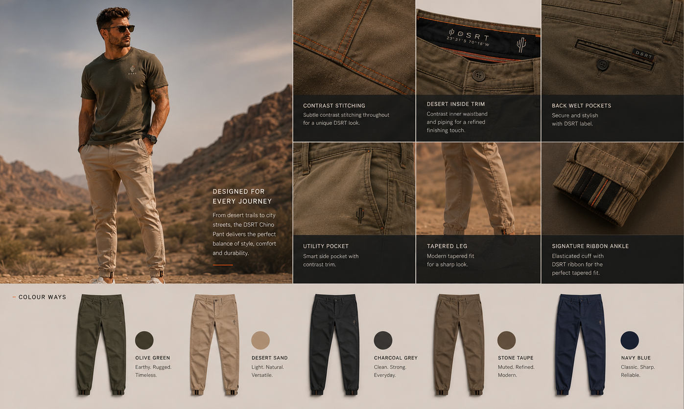
The DSRT chino
The chino concept balances a clean tapered silhouette with functional detailing. Contrast stitching, branded trims, secure pockets and the signature ankle ribbon translate the DSRT identity into the garment construction itself.
The range was also explored across olive, desert sand, charcoal, stone and navy to establish a practical colour architecture that could work with the tees, outerwear and footwear concepts.
Function
Movement, comfort, secure storage and everyday durability.
Signature
Contrast stitching, desert-toned trims, restrained branding and the DSRT ankle ribbon.
From concept to specification
Taking the split tee beyond a visual idea.
The three-quarter split tee became the most developed expression of the DSRT concept.
Its vertical colour division created a recognisable silhouette while allowing the brand's contrast principle to become part of the garment construction rather than an applied graphic.
The concept was developed into a detailed technical pack covering garment views, construction, placement, measurements, colourways and production information.
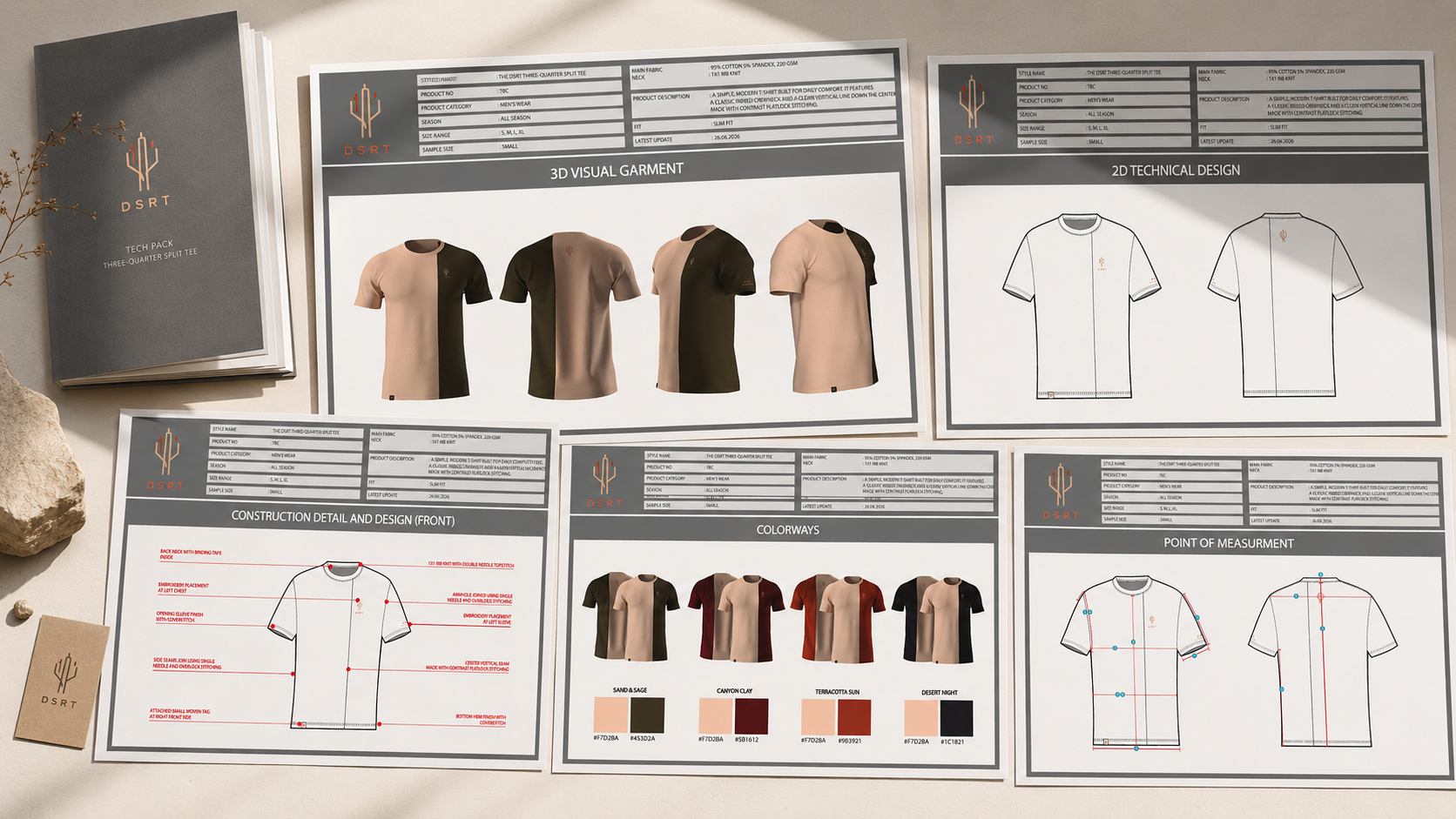
What the technical pack includes
- —3D garment visualisation
- —Front and back technical drawings
- —Construction and seam details
- —Embroidery and branding placement
- —Colourway development
- —Point-of-measurement guidance
- —Labels and supporting product information
Why it matters
The technical pack demonstrates how the visual concept could move toward production.
It translates styling decisions into a clearer system of construction, measurement, placement and material direction that could be communicated to manufacturers and suppliers.
A connected range
One visual language, applied in different ways.
Across the product concepts, the brand remains connected through a small number of recurring decisions.
- 01Contrast is built into the garment rather than added afterwards.
- 02Branding remains controlled and secondary to the product.
- 03The colour system allows individual pieces to work together.
- 04Functional details are treated as part of the visual identity.
The result is a range that can expand without every item looking identical.
Beyond apparel
Extending DSRT into the journey around the product.
The DSRT system was also explored through accessories and launch communication.
The weekender duffel concept applies the same contrast, material and colour principles to a travel product that fits naturally within the wider brand world.
The development includes the initial inspiration, concept sketch, material direction, technical views and a final social media application.
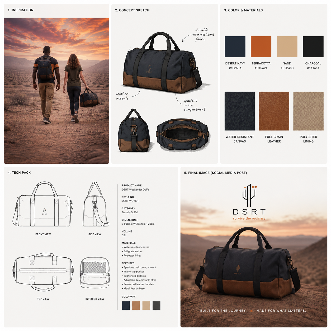
The accessory exploration shows how the brand could move from apparel into travel and lifestyle products while retaining the same recognisable balance of dark neutrals, warm leather tones, clean construction and restrained branding.
This remains a concept exploration and should not be described as a manufactured product.
Systems and planning
The work extended beyond the visible product concepts.
The broader DSRT project also included early supplier research, product-category planning, colour architecture, packaging concepts, influencer ideas, campaign planning and systems for organising future products and brand assets.
These supporting structures helped shape DSRT as a potential business and product ecosystem rather than only a collection of isolated visuals.
The outcome
A concept with a clear route from identity to product.
DSRT developed from a visual identity into a connected apparel and lifestyle system.
The project demonstrates how one central idea can guide brand positioning, garment construction, colourways, technical documentation, labels, accessories and campaign direction.
Although the brand remains in development, the work establishes a strong foundation for future sampling, supplier engagement, range refinement and launch planning.
01
A recognisable identity
A restrained visual language designed to remain consistent across garments, accessories and communication.
02
A connected product system
Core apparel pieces, colourways and details developed to work together rather than as isolated concepts.
03
A stronger technical foundation
The signature split tee translated into technical drawings, specifications, measurements and production-facing documentation.
What this project demonstrates
Thinking beyond the surface of the brand.
DSRT allowed me to approach design as both a creative and commercial system.
The project required me to think about how an identity would function on a garment, how a garment would be communicated to a supplier, how multiple products could form a coherent range and how the same idea could continue into packaging and campaign content.
That wider perspective is what moved the concept beyond a logo exercise and into a more complete brand-development project.