/ Case study
Catalisto
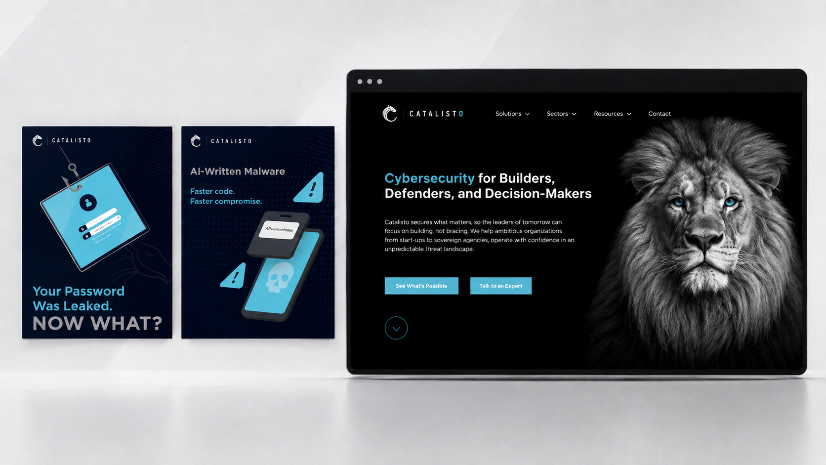
Cybersecurity brand and digital system
Overview
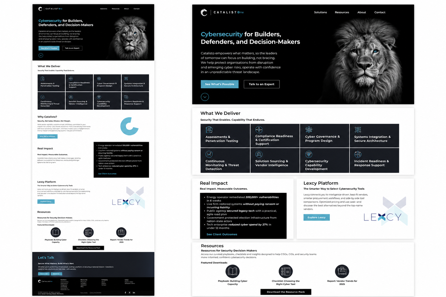
Catalisto needed a more focused and consistent brand presence across its website, technical communication, campaigns and internal/external design material.
The problem
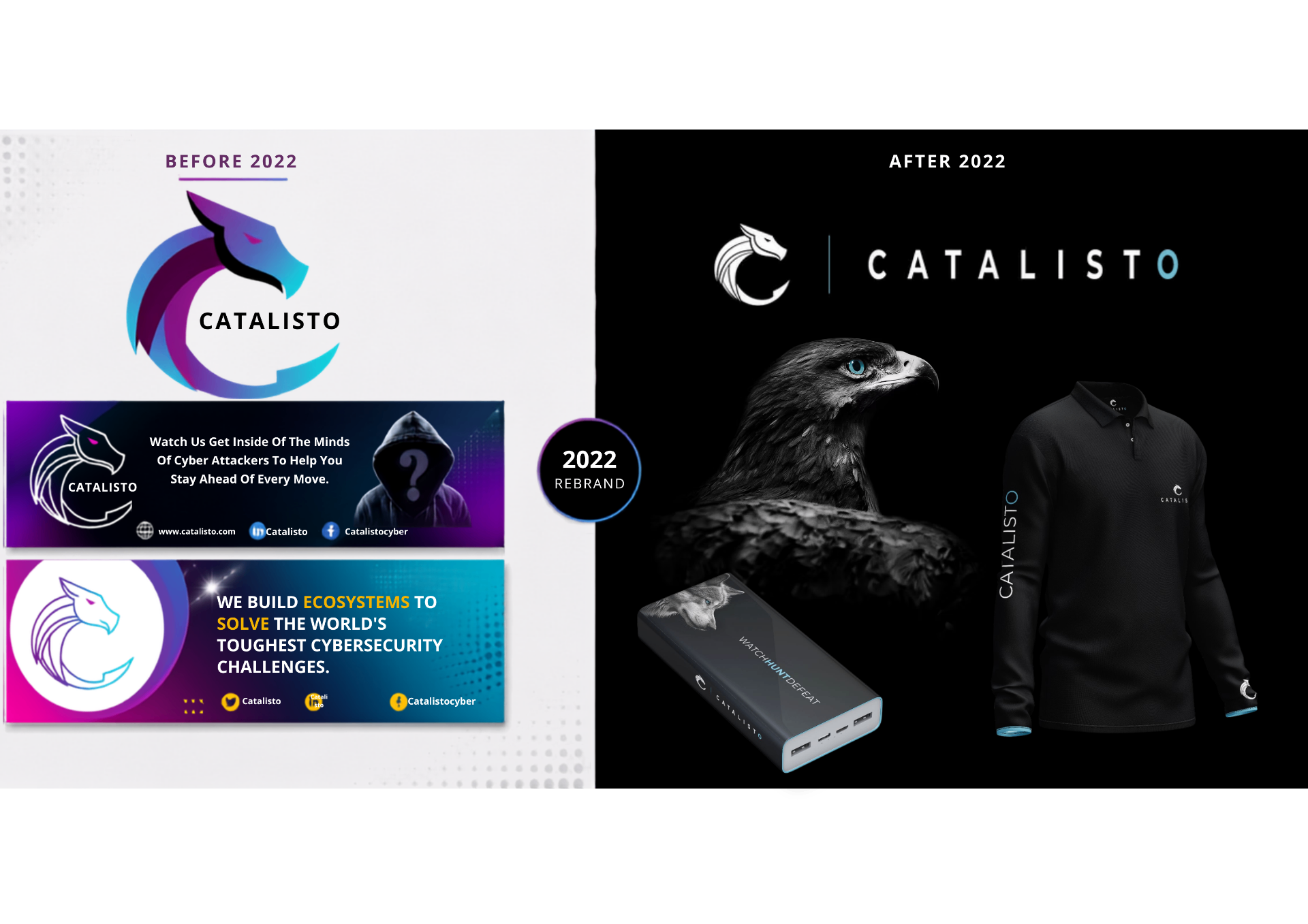
The brand had strong expertise but its visual communication needed more consistency, hierarchy and recognisability across digital, print and presentation touchpoints.
Solution
The refreshed direction gave Catalisto a sharper, more consistent visual presence and made technical cybersecurity communication feel more structured and recognisable.
Reflection
This project shows how brand consistency, hierarchy and restraint can make technical businesses feel more credible without overcomplicating the design.
My role
- Brand identity refinement
- Website design
- Digital design
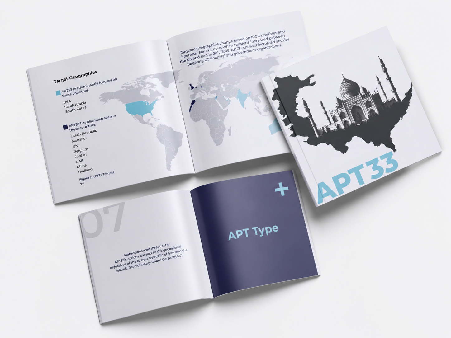
- Technical publication design
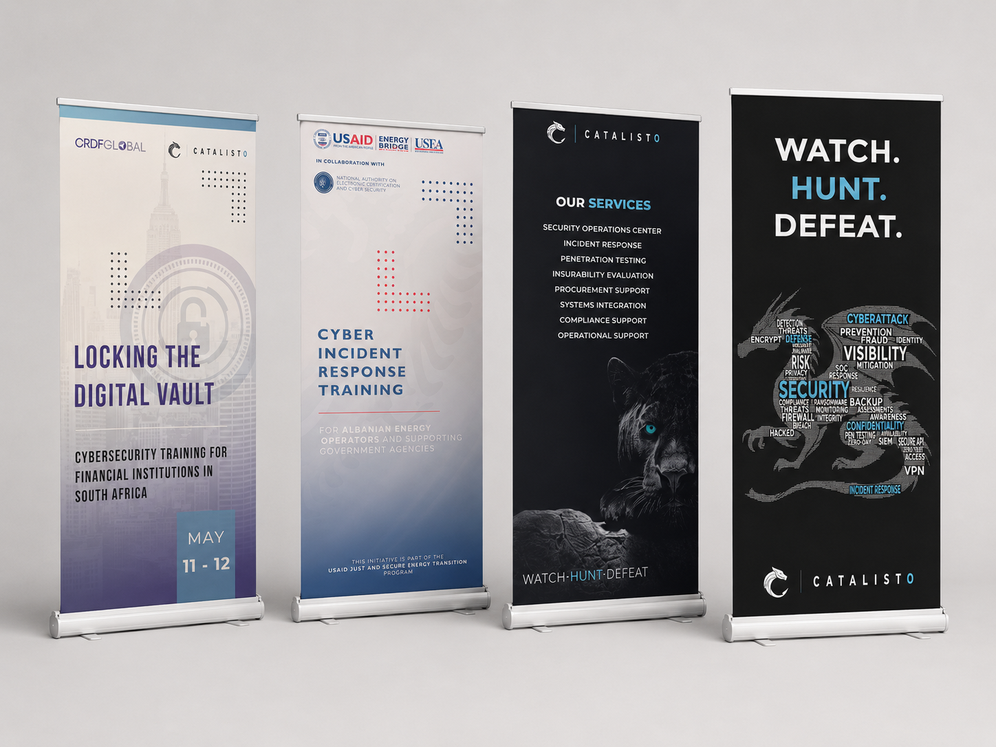
- Campaign assets
- Presentation and collateral design
What I did
- Refined the brand's visual direction
- Designed website and landing page layouts
- Created technical and editorial design assets
- Developed campaign and social material
- Built presentation and communication templates
- Applied the identity across digital and physical touchpoints
Selected visuals below